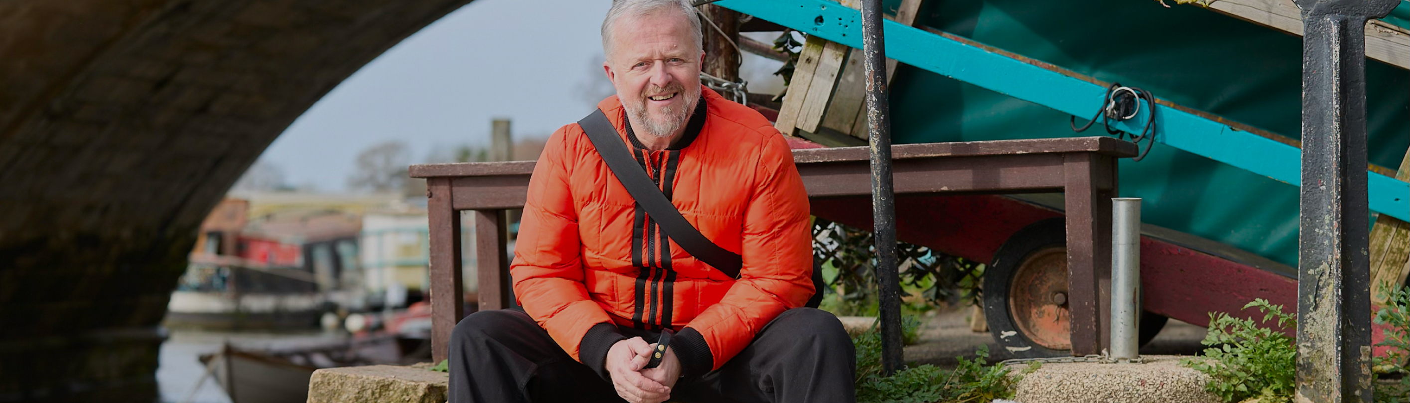
Mick Mahoney has spent three decades telling other people who they are.
He has been Chief Creative Officer at Ogilvy, Havas and Y&R, and appeared in Campaign's annual list of top creative directors at all three. Nobody else has done that. He won a Cannes Grand Prix for Stella Artois, One Show Best in Show for Johnnie Walker, 16 Cannes Lions and 32 D&AD Pencils. He took Ogilvy from a 35% revenue decline to a 70% increase in twelve months. He chairs the D&AD film jury, gave a TED talk, and has written two best-selling books with two more coming.
He could not do any of it for himself.
His own words on what the old site was costing him:
"It's the cobbler's children that end up going barefoot. It didn't in any way represent the experience you would get with me. Because it was off the shelf, it made me look a bit off the shelf. And I'm not. I'm bespoke. You have to pay more for bespoke. I'm not a gun for hire, and that's what it looked like. It looked cheap, and I'm not cheap."
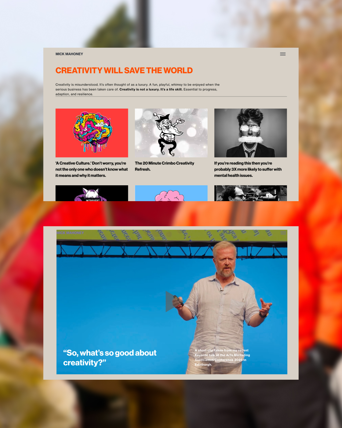
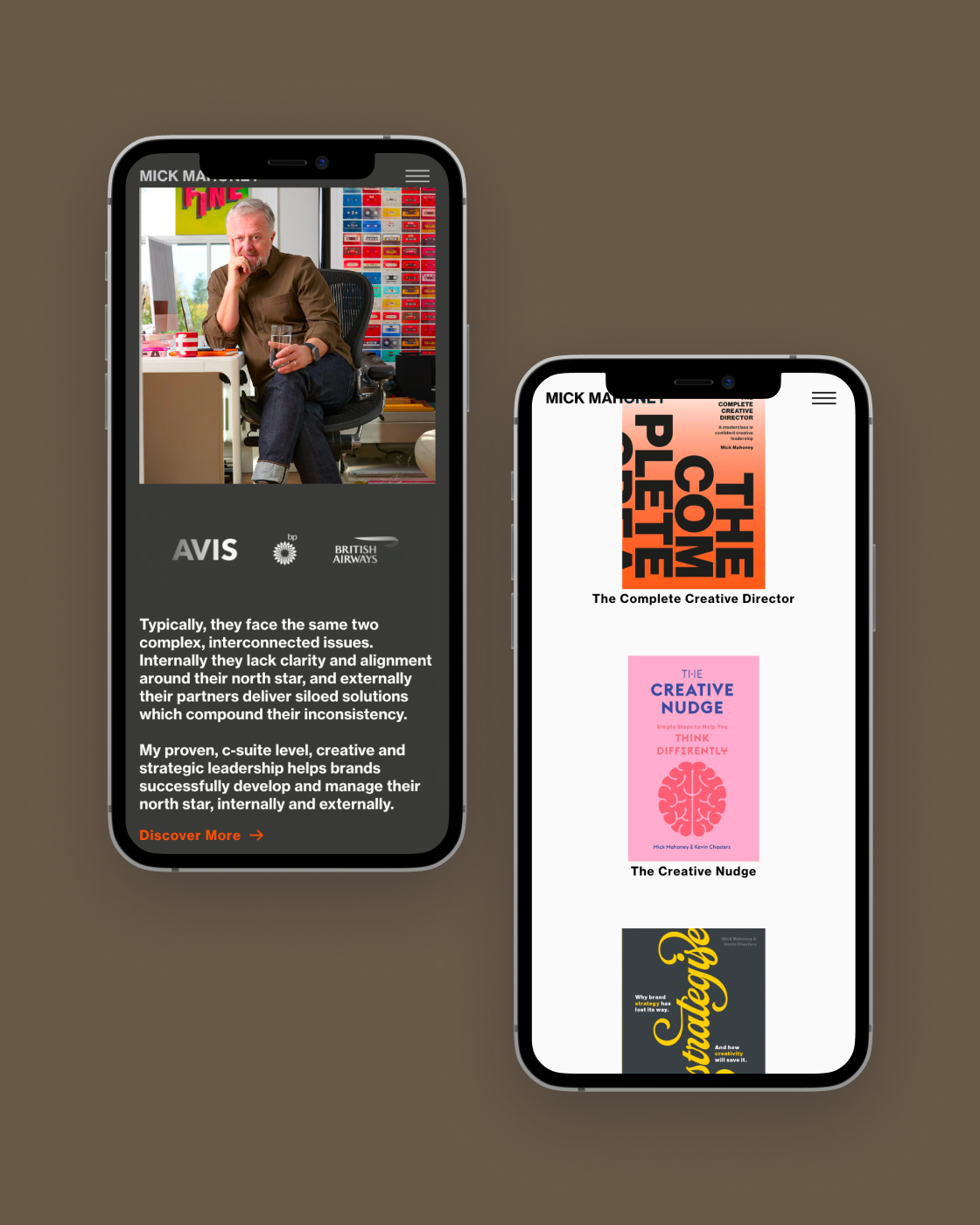
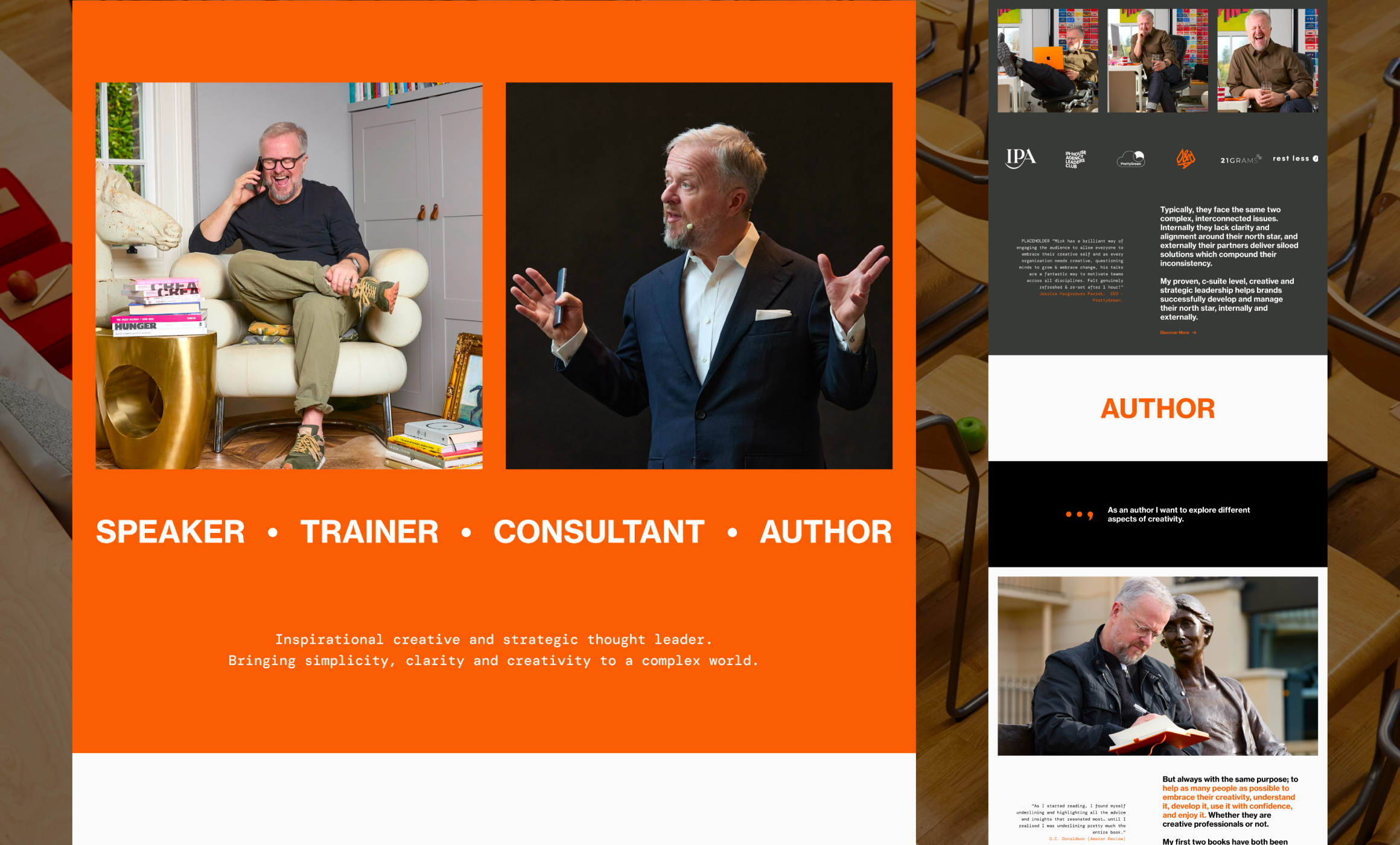
The site listed thirty years of work and gave priority to none of it. Consultancy, talks, coaching, books, writing were all treated as equals. A visitor with a problem had to work out for themselves whether Mick was the answer.

CMOs want a strategic partner who can hold a boardroom. Conference producers need a marquee speaker and a booking process that takes ninety seconds. A creative director's question is different: has this person actually done the job at the highest level?
Three different needs. One site trying to serve all of them in a single voice.
The audit ran on three principles: value, friction, distraction. Each page had to communicate a clear benefit, reduce the steps a visitor needed to take, and cut anything that didn't earn its place.
These are also the principles behind both his books. Eliminating noise so creativity can flow is the spine of his published method. He said it himself months after launch: "I'm all about bringing simplicity to a complex world. If my website didn't deliver it, I'd have fallen at the first hurdle."
The brief came down to two words: calm and complex. A site that doesn't shout and doesn't perform.
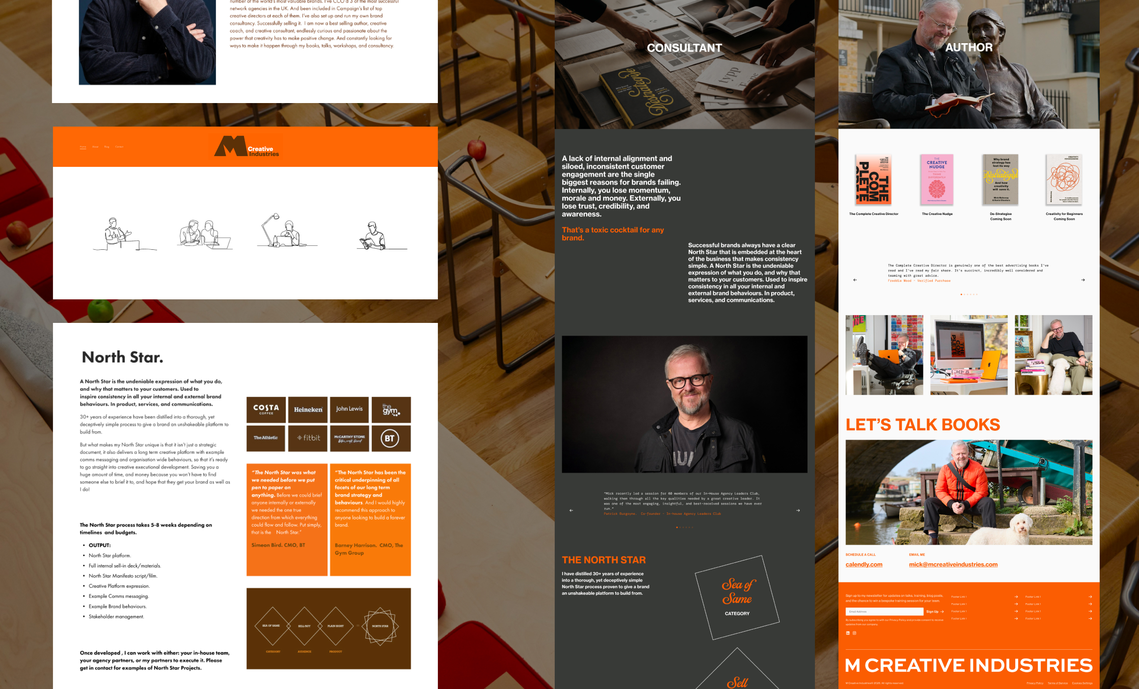
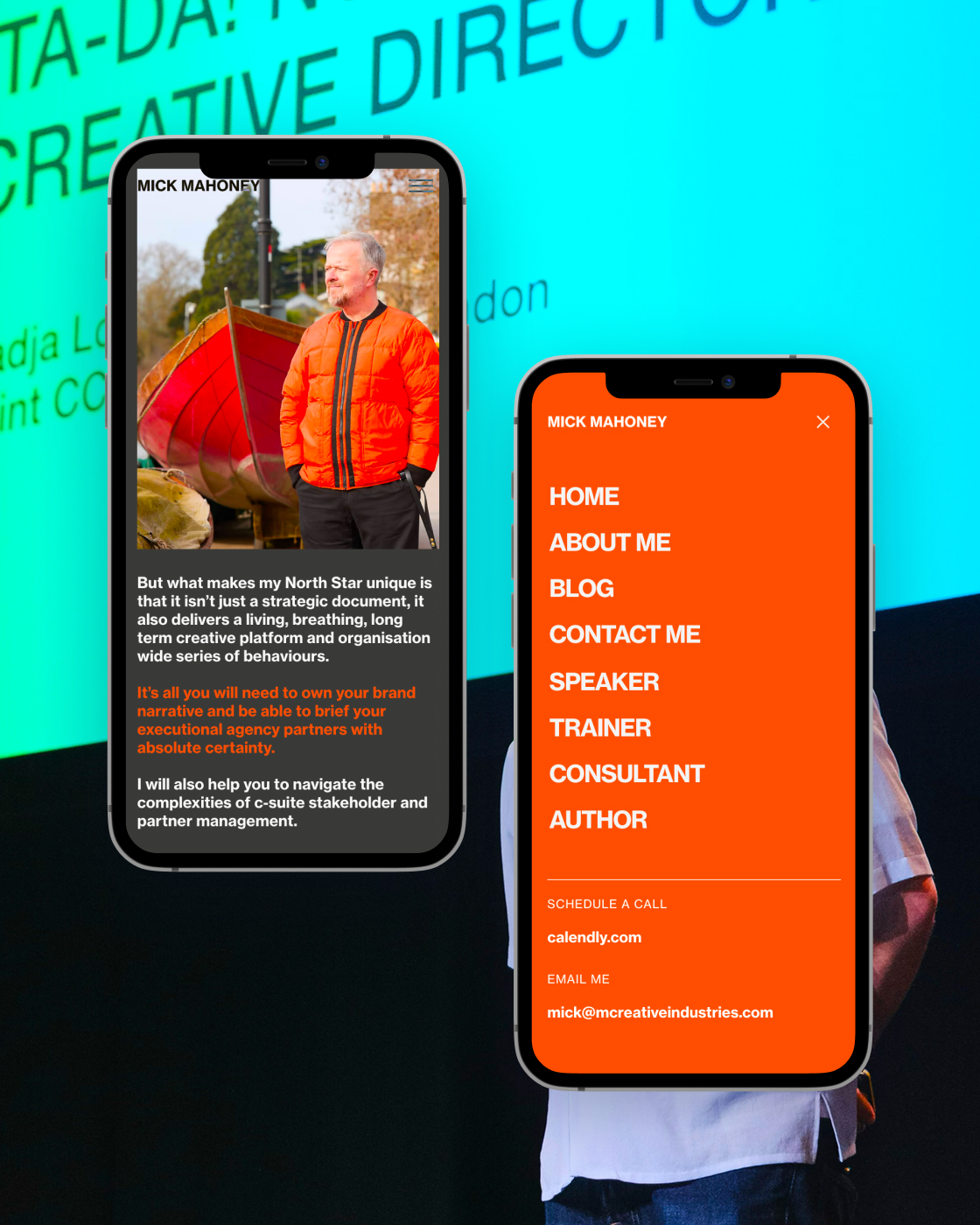
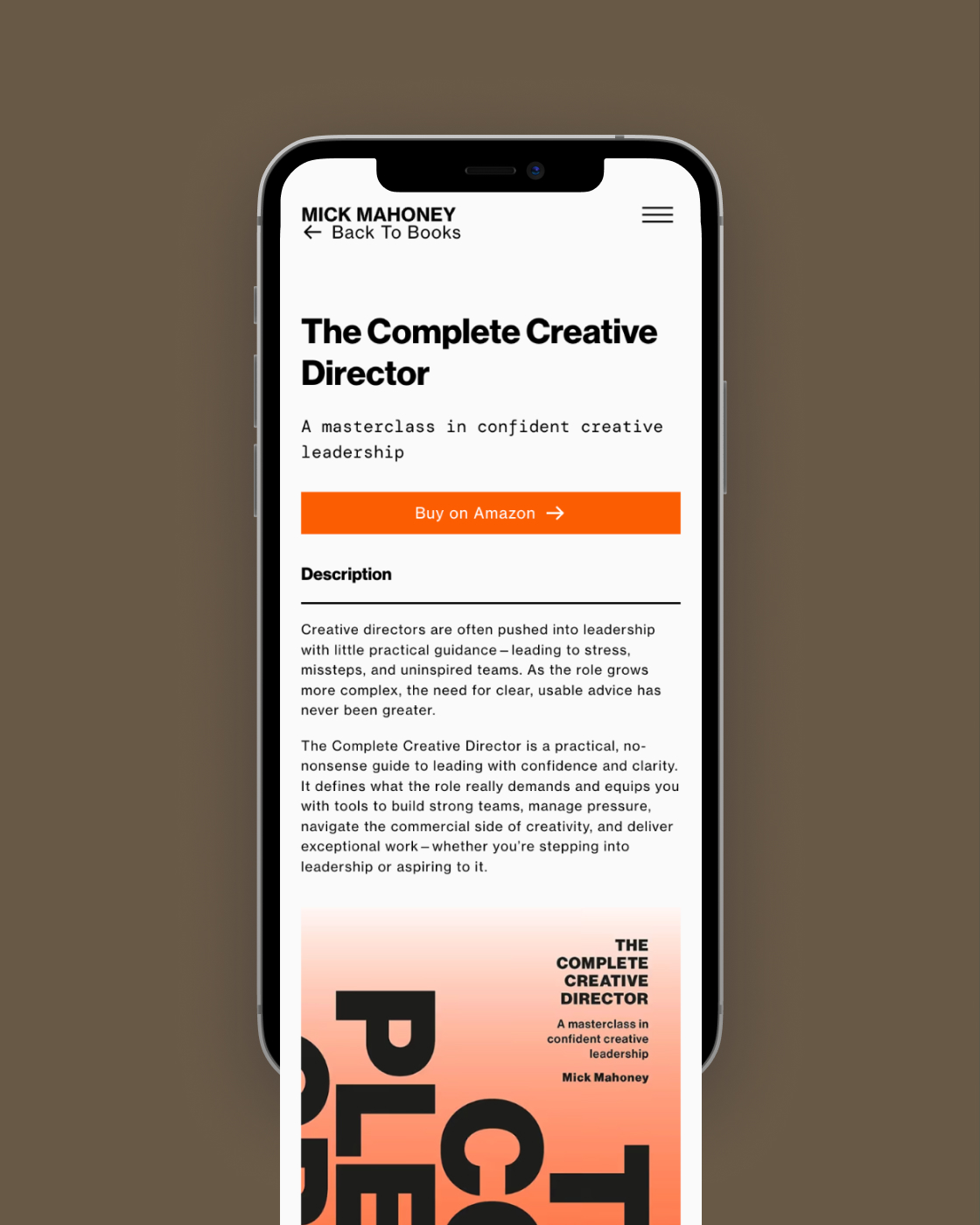
An audit first. Every page scored on value, friction and distraction. Findings were ranked by severity against ease of fix. The output was a prioritised sequence, not a critique.
A two-hour workshop, in person. Four UX pillars were agreed before a single pixel was placed: clarity of positioning, conversion and trust, navigation and structure, and striking and memorable. Every decision after that was measured against those four.
One organising principle. Half an hour in, the project found its answer: stop being everything to everyone.
Three journeys, mapped end to end. Each audience got its own path, proof and point of action, across awareness, understanding, commitment, engagement and advocacy. Thinking, feeling and pain points were written out at every stage.
Typography that holds the contradiction. Neue Haas Grotesk carries the headlines and body. DM Mono works as an accent because it reads like a typewriter. Mick is a C-suite consultant who is, first and last, a writer. The type had to say both.
Colour with a reference point. His signature orange was pulled toward Hermès: premium and warm rather than loud. Neutrals carry 60%, with brown and beige taking the rest. Each service page has its own accent, so a visitor always knows which Mick they're looking at.
An about page that doesn't boast. This was the hardest problem on the site. With 150 industry awards to show and understatement as the core positioning, the answer was a plain list with imagery revealed on hover. Stated, never performed. Mick's verdict: "There's nothing more boring than those bloody 'and then Mick did this'."
The work restarted from zero. At the end of one round, with a direction Mick had already approved, I decided it wasn't right and started again.
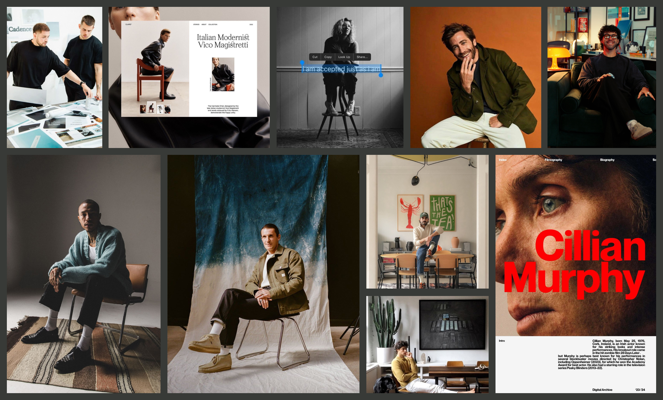
Art direction that produced new work. Photography direction was written and briefed, then shot by Mick to that brief. The images exist because of the strategy.
A design system, not a set of pages. Type, colour, spacing, breakpoints, icons, components and a refined logo. The site grows with the business instead of being rebuilt each time it changes.
Built and wired. Developed in Webflow with Dang Nguyen. A CMS Mick runs himself for podcasts, books and talks. Kit connected for list capture. Calendly set up with pricing and qualifying questions, so a paid hour of his time can be booked without an email.
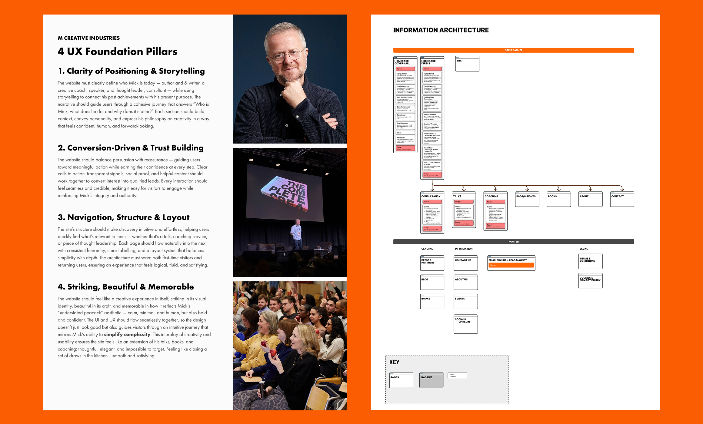
The most useful thing to come out of this project wasn't a page. It was a shape.
Mick's North Star is the device at the centre of his consultancy method: three components that combine into one. His original designer had drawn the three parts as elegant interlocking triangles. In the redesign, I made them ordinary, set at angles, so the star only appears when all three are brought together.
Mick spotted what that meant months later, while working on his book.
"You took the North Star, you deconstructed it, but left it in its shape. You made three ordinary shapes that, when they're put together, turn into this magical shape. That is what the North Star is. That's what my process is."
He told his book designer he wanted to copy it. It's in the book, published this November. Every slide in every presentation now uses the same construction. And it has a name: the Destrategise North Star, a positioning device he can point at, own and sell.
His summary: "It's a proper product now."
On the numbers. The newsletter has collected 39 subscribers without a single campaign, promotion or email. Analytics only went live in September, so the traffic picture starts from here.
Mick is direct about why the rest is still to come, and he isn't blaming the site: "I'm not driving people to it correctly. That's not the fault of the website. That's entirely down to me." With a book landing in November and a social lead now hired, that changes.
What the site does today, in his words:
"It validates. Anybody who might have heard of me, or doesn't know much about me, or has never heard of me, I can direct them to something that represents me and that I'm very proud of. And that always leads to people going: absolutely, fair play. I couldn't ask it to do any more than it does at the moment."
"I listened to you. I wasn't always comfortable, but that makes me happy, because it means I'm being forced out of my worldview. You were so determined. You knew what you wanted to achieve. It was almost like: Mick, I've got this, calm down, I can see it more clearly than you can. And I think you could. I look at it now and I go, I'd have never got to that place."
"You didn't just do my website. You absolutely helped me to think about everything I was doing, what I was offering, how I was presenting myself. Everything."
"Everybody says it feels absolutely right for you. It feels like you. Calm, authoritative, interesting, fun. All the personality KPIs we set. It gets played back to me the whole time."
Mick has since joined Studio Portolan as Non-Executive Director.
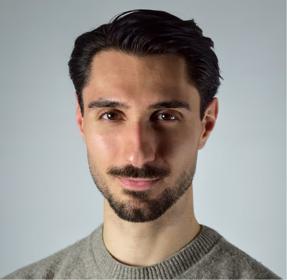
Director & Many Creative Hats
Whether you have a clear brief, a loose idea, or just a sense that something isn’t quite clicking, it starts with a conversation.
A focused 30-minute call to understand your product, your goals, and your customers. From there, we shape the positioning, clarify the journey, and design an experience built to convert.
No pitch deck. No pressure. Just clear thinking, a defined outcome, and a path forward that makes sense for your business.