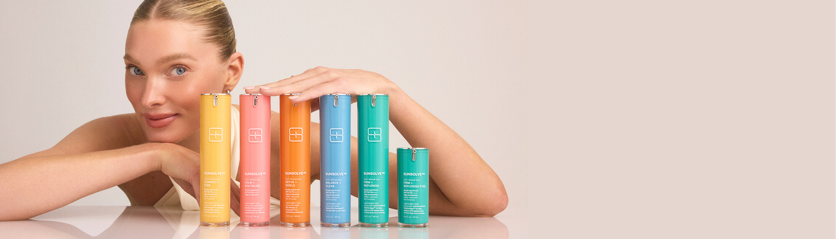
SunsolveMD is a clinical skincare brand with 20 patents pending, its own formulator, completed clinical trials, and Elsa Hosk as brand icon. It sells into Harrods and Liberty at a price point north of £80 a bottle. Vogue, Forbes and Cosmopolitan had all covered it.
In the 90 days before the engagement, the site took roughly 80,000 sessions and converted at 0.17%.
That isn't a marketing failure. The traffic was arriving. The press was landing. The product was real and clinically proven. The site was where it all stopped.
The founder put it plainly on our first call:
"You can tell from the language that I'm someone who overbuilds a brand. I write the text as if I'm speaking to a biotech audience. A lot of the text on the website hasn't been built for a consumer who's logging on and just thinking: well, I have hyperpigmentation, what do I use?"
And:
"As members of the founding team we're very product first. We love our product, we love our science, we love the fact that we've got 20 patents pending. The average consumer doesn't really care. When they come onto the website they're thinking: I've got spots, what does this do, can I use it?"
The product detail page, where most of that traffic landed, was a Shopify theme a contractor had bought in. Its original purpose was selling handbags. Benefits were buried in dropdowns. The founder's verdict: "I absolutely hate these product pages. I despise them."
Between 60 and 70 per cent of that traffic was on mobile.

A visitor landing on that site had two questions. What is this, and why is it £80?
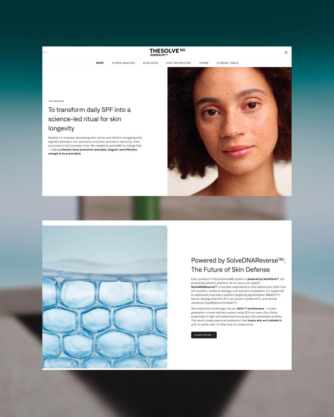
The site answered neither in the first ten seconds. It led with patents, clinical development and formulation technology. All true, all impressive – and all arriving before the customer had been told what the product does for the thing she came to solve.
The site was not ugly. It was sequenced for the wrong reader.
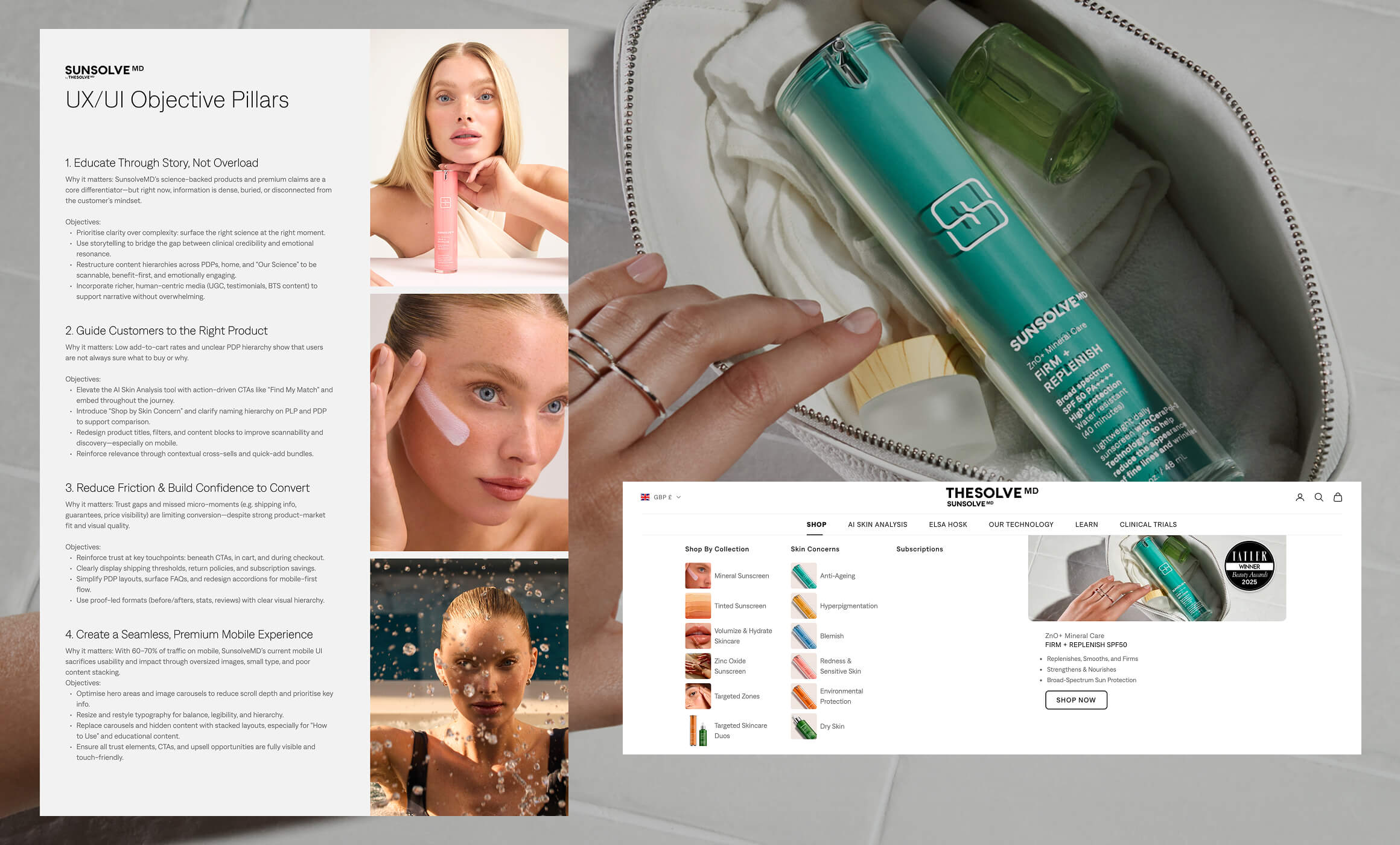
The audit produced four objectives. Everything downstream was measured against them.
Educate through story, not overload. Surface the right science at the right moment rather than all of it at once.
Guide customers to the right product. Low add-to-cart rates and an unclear hierarchy meant people were not sure what to buy or why.
Reduce friction and build confidence to convert. Shipping thresholds, returns, guarantees and price clarity were missing at the exact moments people hesitate.
Create a seamless premium mobile experience. Two thirds of traffic was on a phone, meeting oversized images, small type and badly stacked content.
There was history here, too.
I first worked with SunsolveMD in 2022, brought in alongside Pearlfisher while the brand was still pre-launch and raising. Pearlfisher held brand and strategy. I held the digital experience: information architecture, wireframes, high-fidelity design across 25+ pages, a style guide and component library, and a functional prototype. The designs ran in the brand's investor decks.
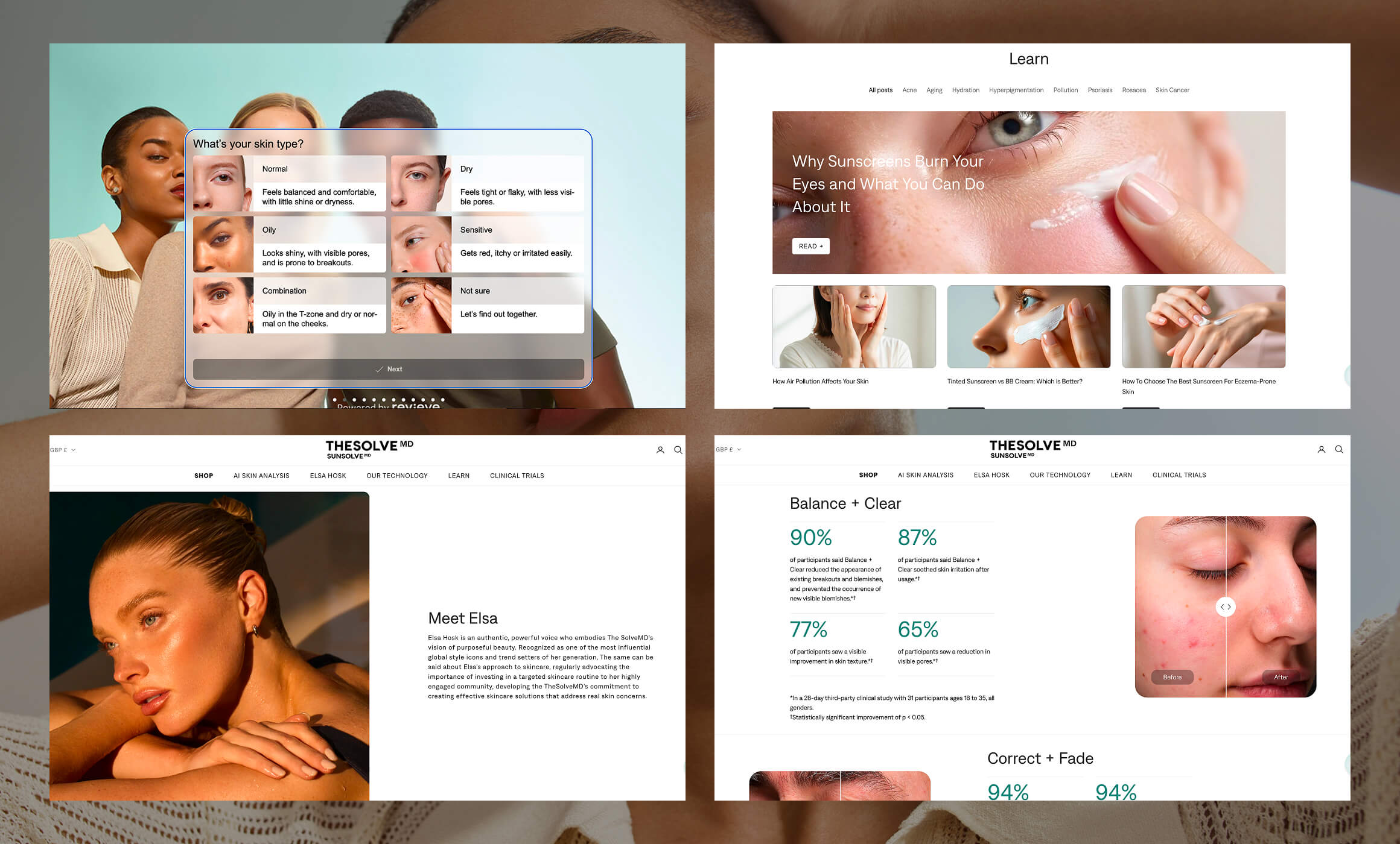
That work was already built around commercial outcomes. A 10ml tester as a cart add-on to lift order value. Subscribe and save positioned to lift lifetime value. Quick add-to-cart so browsing converted without a detour. An AI skin scan to recommend products by skin type, replacing the usual quiz. Dermatologist consultations bookable from the site.
None of it was built. After the engagement, a Shopify theme was bought and retrofitted to approximate the designs, down to the corner radii and background treatments. The site that launched looked roughly like the plan and behaved nothing like it.
Four years and several agencies later, the brand came back.
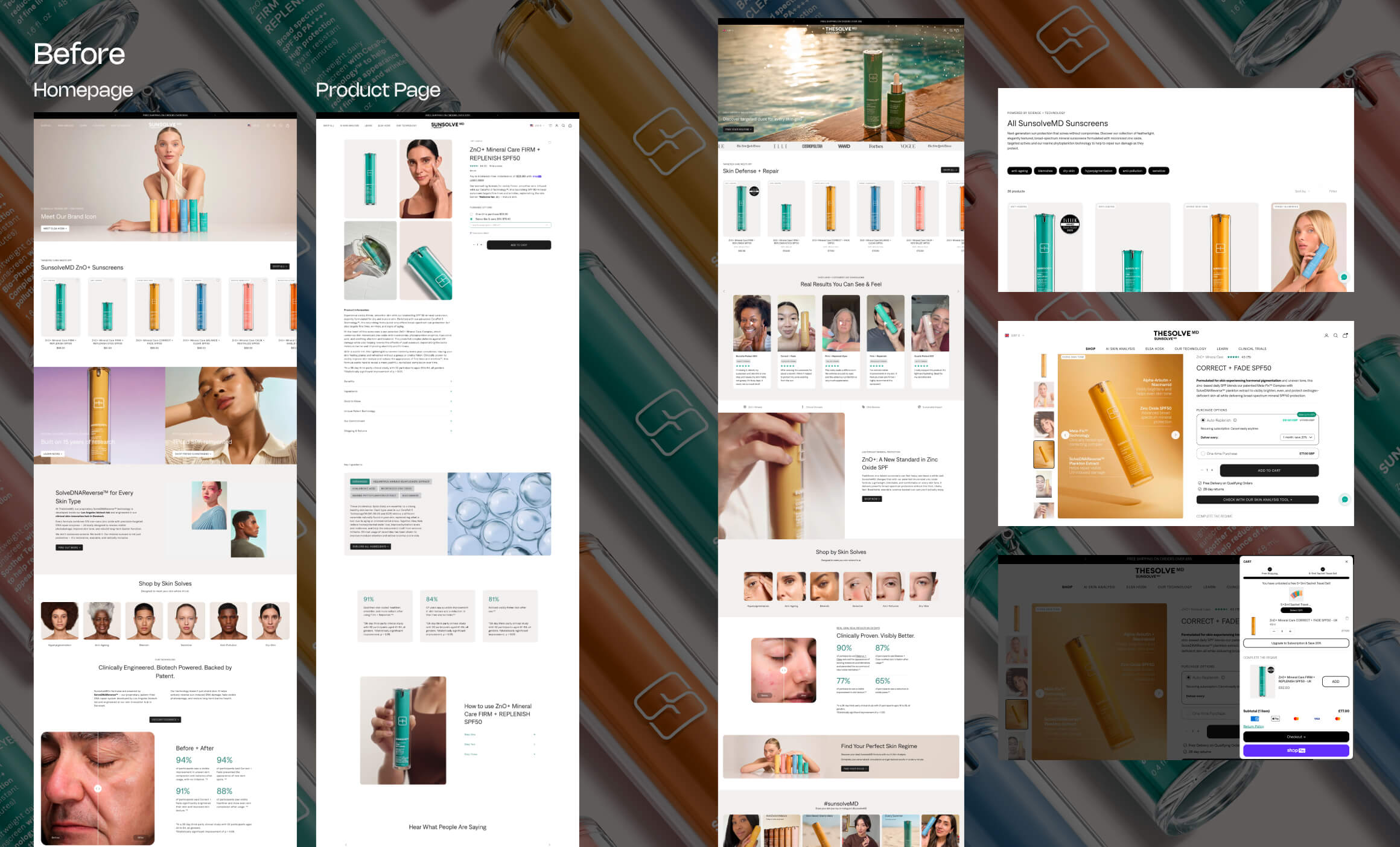
A full audit on three principles: value, friction, distraction. Every page in the path to purchase, desktop and mobile, scored on severity against ease of fix, and read against Hotjar scroll maps, click maps and session recordings rather than opinion. Alongside it: a Shopify analytics review to find where the drop-off actually sat, an SEO audit that surfaced eight errors including duplicate title tags and missing H1s and meta descriptions, a Klaviyo review of the flows and welcome offer, and a funnel review across Meta, TikTok, Instagram, Google Shopping and PPC. Then a competitor analysis, direct and indirect, including the brands the founder herself named as references.
Everything was phased deliberately so each change could be attributed to a result. As the Head of Ecommerce put it when we discussed shipping it all at once: it would be very difficult to identify what was having the effect.
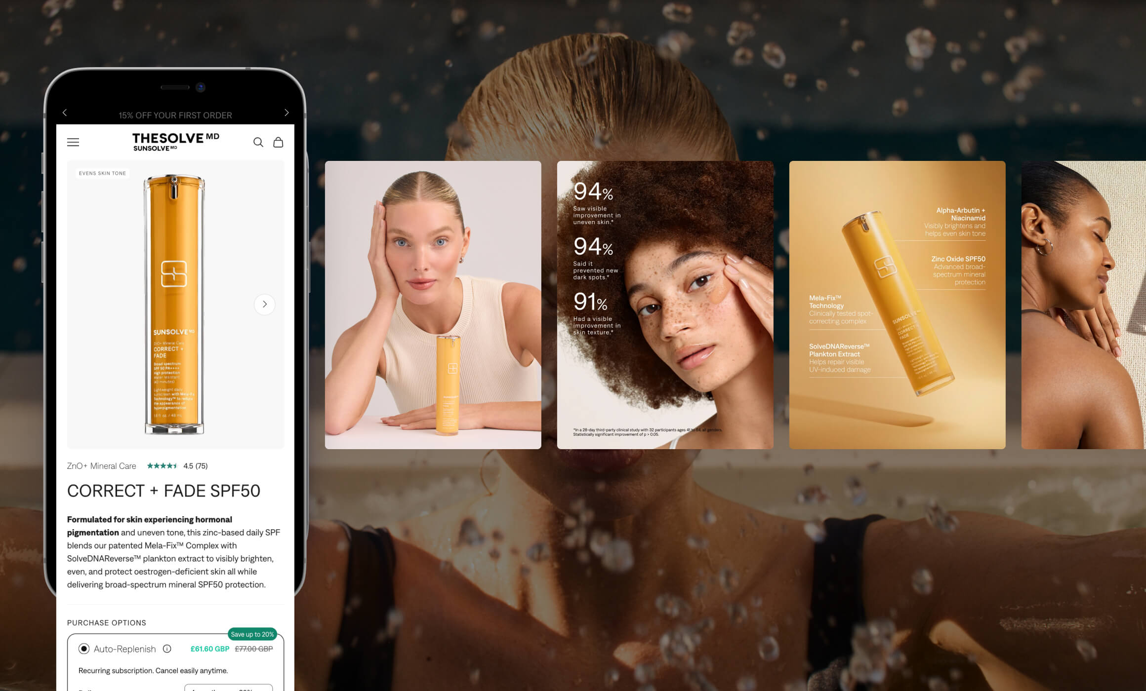
The carousel discovery. The session data showed the product page image carousel was the most interacted element on the page, and that drop-off happened early in a very long scroll. People were looking at the pictures and never reading the copy underneath. The carousel itself was doing nothing: a front-of-pack shot, a zoomed-out application shot, some lifestyle imagery. No education, no benefit, no reason to buy.
So the carousel became the page. Photography art direction called for close-ups of the cream on skin, with benefit overlays, USPs and free-from icons composited onto the images themselves. Before-and-after clinical trial results moved in alongside them. If the gallery was where attention went, the gallery had to carry the argument.
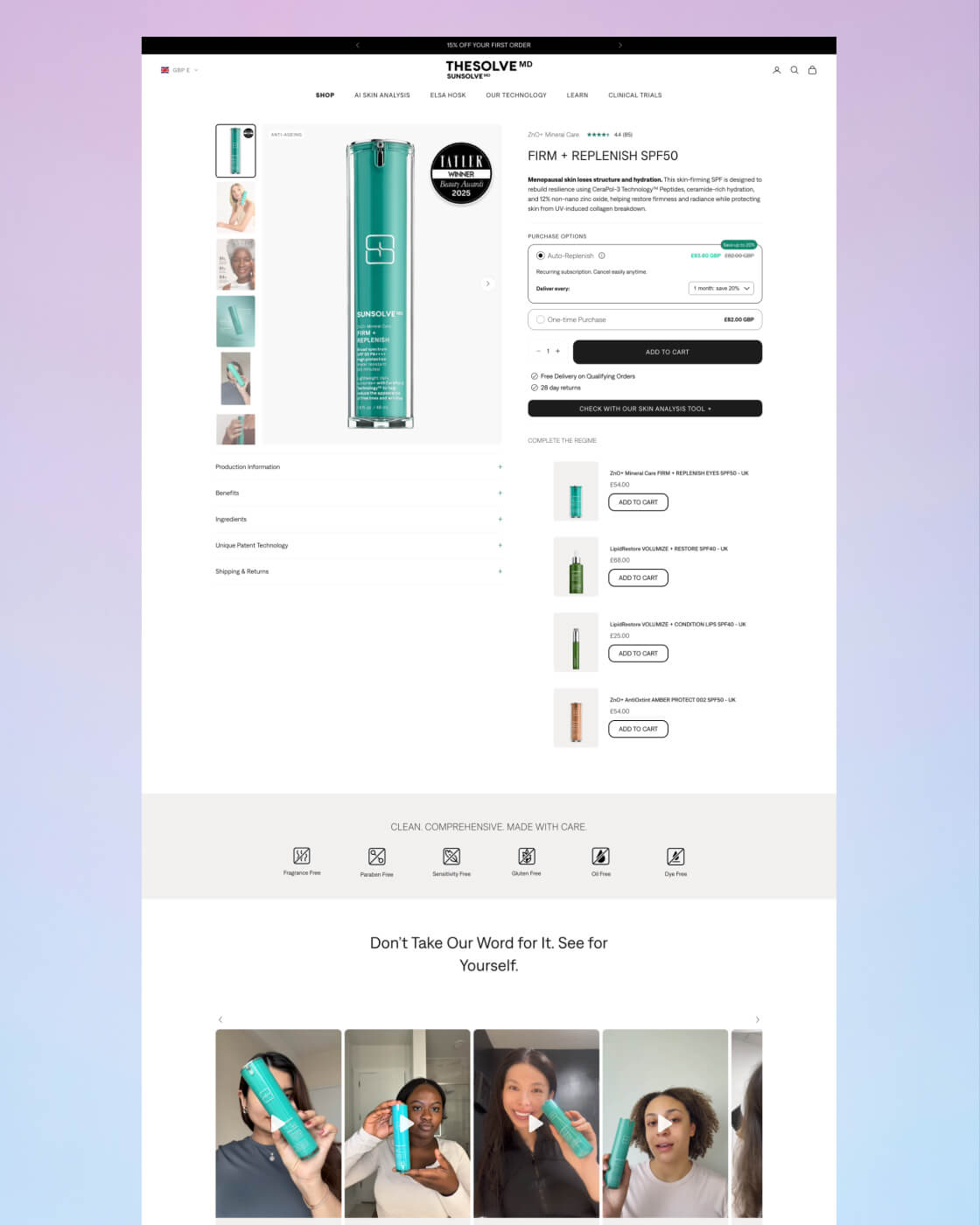
The product page rebuilt around the customer. Two full versions, the second pushing considerably further than the first. Benefits pulled out of dropdowns. The remaining long-form content categorised into accordions: product information, benefits, ingredients, patented technology, shipping and returns. UGC moved higher. Ingredients condensed from a stacked block into a scannable card row. Padding, paragraph spacing and letter spacing tightened throughout. The page ended up dramatically shorter.
Language that matched the price point. Subscription became auto-replenishment. A cross-sell became "complete the regime," adding the matching products for a customer's specific routine rather than a generic recommendation.
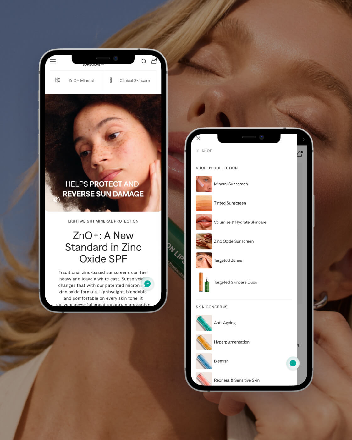
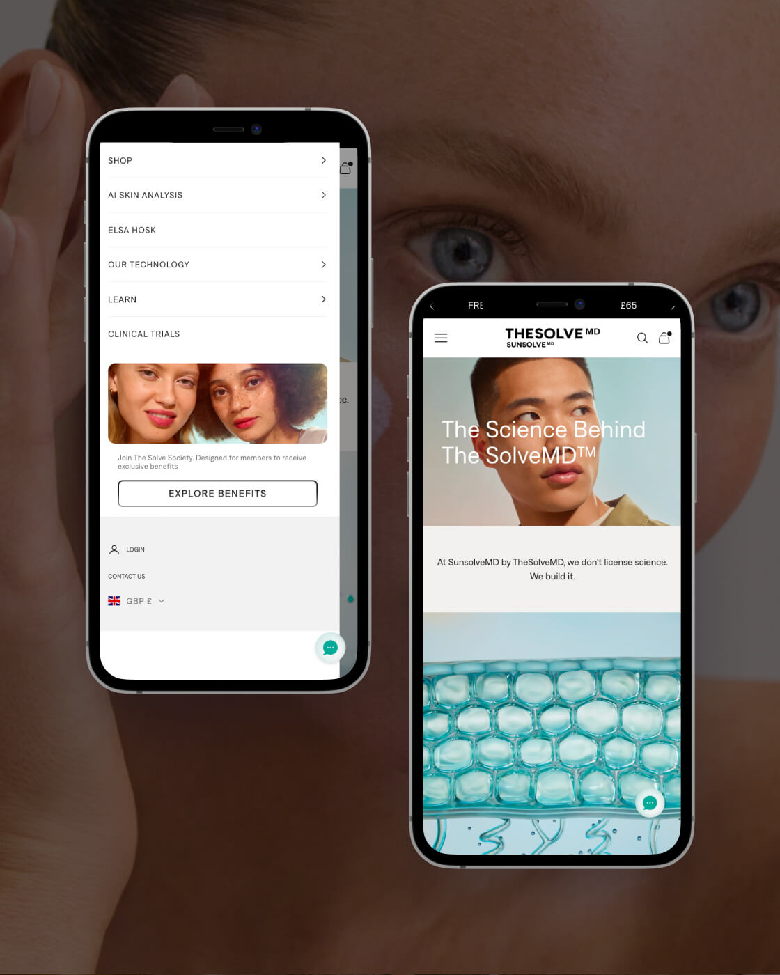
Navigation rebuilt around the customer's problem. The original menu repeated product names across columns. The replacement splits into two paths: shop by collection, and shop by skin concern. Each concern carries an image, so a visitor sees the condition and the product together and makes the connection without reading. Every product in the range has a different colour, so the visual bridge does the work the copy was failing to do. The remaining columns carry promotional space, and region switching was cleaned up in the same pass.
Homepage led with the customer, not the ambassador. The hero moved from "meet our brand icon" to a benefit-led line. The shop-by-concern imagery moved from generic model faces to close-ups of the actual skin conditions the products treat, so a customer could see what she was shopping for.
A loyalty programme designed at group level, three tiers, named The Solve Society. Built for the parent company rather than SunsolveMD alone so it carries across future product lines, and structured around gifting rather than discounting, because a brand at this price point that trains customers to wait for a sale has a problem it cannot design its way out of.
Run as an engagement, not a handover. A private Slack channel and a ClickUp board with every phase mapped from day one. I brought in my own Shopify developer and managed the relationship through to live, so the design that shipped was the design that was approved.
Conversion rate rose 8.5x over the engagement. Orders are up 67% year on year, average order value is up 33%, and sessions are up 61%. Subscriptions and returning customers both grew.
The phasing mattered as much as the work. The cart drawer moved first. The product pages followed and lifted conversion within the first week of going live. The homepage came after that.
Not every section made it into production, which is normal and worth saying. The core of it did, and the product page in particular now does what the data said it needed to do: the carousel educates, the proof is at the top, and the page is a fraction of its original length.
The clearest signal came at the end of the year, when the Head of Ecommerce brought me into a new project for the group across a category expansion the business had not yet made public. Her reason for choosing me is below.
"You've come from an ecomm side. It's just so refreshing, because you know exactly what I'm saying, and our terminology as well. I say a lot of these terminologies and people look at me blankly."


Director & Many Creative Hats
Whether you have a clear brief, a loose idea, or just a sense that something isn’t quite clicking, it starts with a conversation.
A focused 30-minute call to understand your product, your goals, and your customers. From there, we shape the positioning, clarify the journey, and design an experience built to convert.
No pitch deck. No pressure. Just clear thinking, a defined outcome, and a path forward that makes sense for your business.